Modern design and UX for UBRD
In early spring 2014 Ural Bank of Reconstruction and Development (UBRD) publicly launched their new online bank. We started from the scratch in August 2013 and a little more than one month later bank employees were able to login and make some payments. We kept constantly adding new features iteration by iteration and in four months later the new online bank was ready for public launch.
Our relationship with UBRD got started from the happy customer reference, after a former Bank Saint-Petersburg (BSPB) employee left for her hometown Yekaterinburg and told in her new workplace (UBRD) a story how we launched a new online bank for BSPB some months earlier. That was a good match for both sides and soon after the very first Skype meeting we were in close contact. It quickly became obvious for us - the new team on UBRD side had high ambitions and a clear and distinguishable vision regarding the online banking development. They were looking for truly agile partner (which is still not so common in banking): “We know that you have done a good job for BSPB, so do this for us as well!” was the starting message.
Design
Usually with new customers we start with 2-week pilot in order to feel the technical readiness and to improve the estimations for the main project. In this stage we did not focus on the design and used sketches provided by the bank. Later on, when we moved ahead we shifted quite dramatically away from those initial images / drawings.
The only inputs for design we got from the bank:
- the brand book (rather focused on offline presence) and
- it has to be “light as a feather” and “joyous”.
Our designer had 3 weeks of very intense work producing gazillions of drawings, almost exploding before the solution fully satisfied the customer. This was not a surprise for us, because despite softly defined inputs, UBRD managers had quite a certain vision and high ambitions in online banking: strong wish to distinguish in the market, deep integration with social networks, reaching beyond the existing bank customers were just some of the keywords that made for us this project even more challenging and interesting.
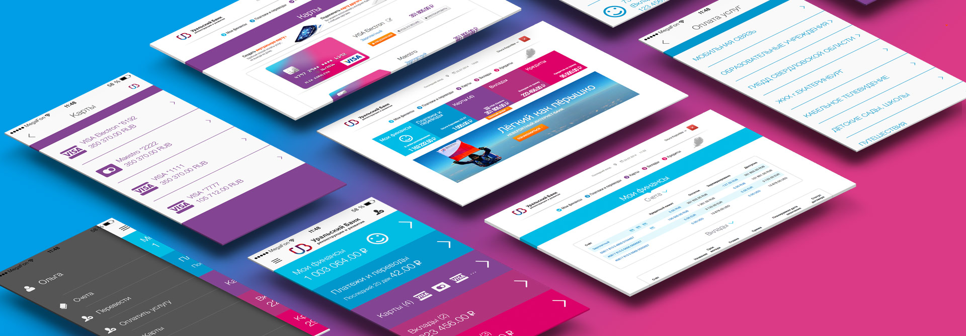
Our main focus was on easy and convenient payments and other common everyday operations, not on sales of new products. We divided the bank services into 5 common groups: info, payments, cards, deposits, loans and assigned to each of them distinctive colors that follow throughout the respective sections. The same colors are used in mobile applications, making it easier for customers to switch between mobile and desktop versions of online bank.
Should we use vertical or horizontal design? Always a tricky question when designing a website. In banking, vertical menu is preferred when there are already many products and there is a high likelihood that the number of menu items will grow - it is easier to expand vertically. In our case the number of bank products was not too long - simple savings and credit products for private customers, so we opted for horizontal menu. The customer can see everything on the screen without scrolling up and down. We also wanted to fit wide account statements with long requisites nicely on screen.
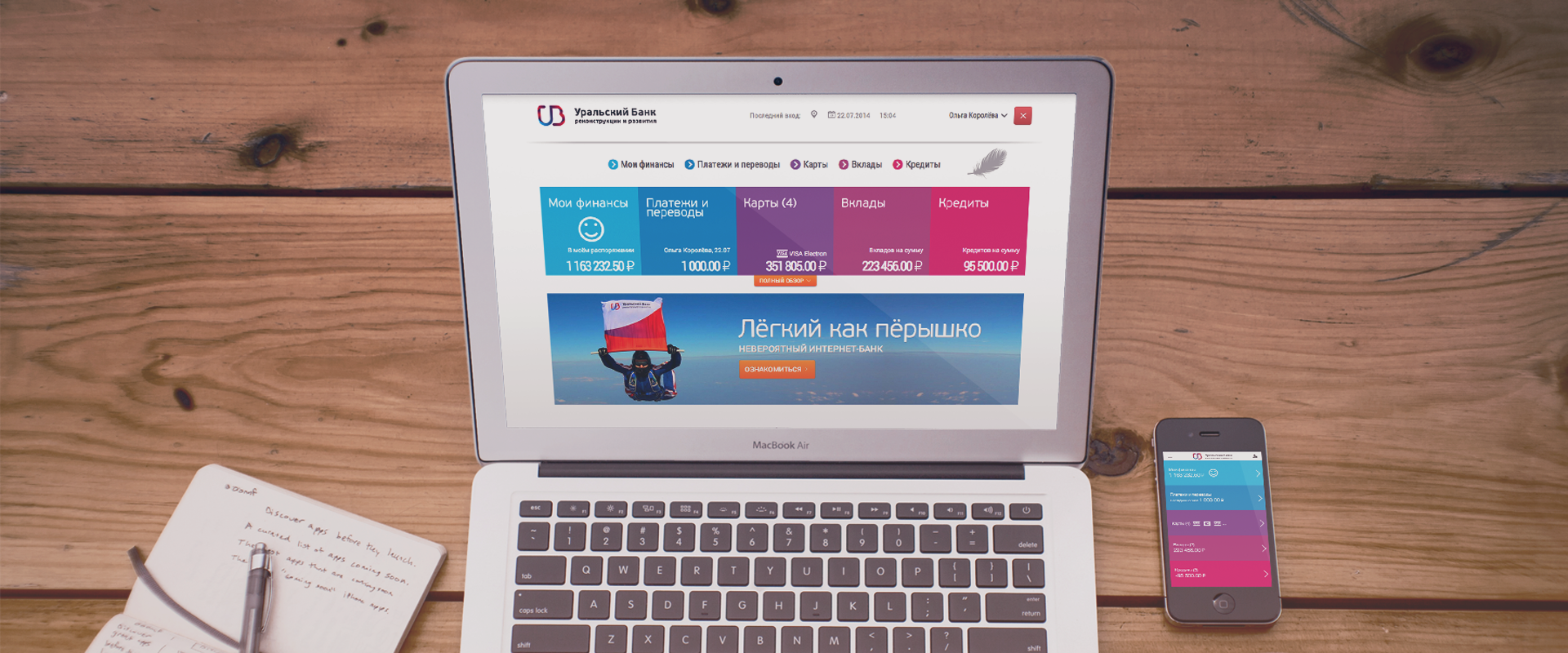
The opening page provides a quick overview of customer finances: balances of all accounts, last 5 payments made online. As we follow closely stats from our online banks, this is the info customers come most often to the bank, therefore it has to be visible right after login. No extra clicks! When a customer is missing a product (say, bank card or loan), we suggest to apply for one in respective menu via direct link.
The bank wanted to make every bank visit joyous and emotional for the customers, so they want to come back more often in a good mood. To reinforce that message, we added smiley emoticons as the carriers of good mood.
We started off with a concept “easy service, no selling”, but over time the bank also asked to integrate smart selling features. We made it possible for webmaster to manage personalized offers for each page and each customer within online bank.
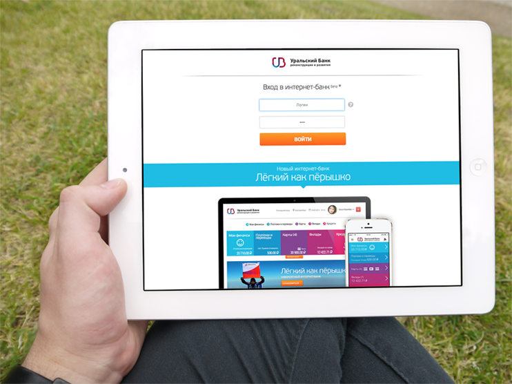
We also follow the principle that full-blown version has to work on tablets as well, i.e. our design is always adapted to smaller screens and touch events.
“Don’t make me think” - how to hide complexity and improve usability?
Banking is a complex world (or at least this is how banks present themselves) and there is always loads of bank-specific details that are not easily understandable for non-banker. Our aim is to maximally hide that complexity from the end-user to achieve a pleasant user experience. Here are a couple of examples, what we mean under simplifying.
Previously, the bank offered three types of usernames for login to online bank (fixed numeric internal ID and changeable textual and numeric usernames). Poor customers needed to select the type of username before entering it. We decided to hide this step from the customer and whatever is entered, we just detected the type of username automatically.
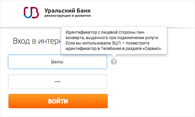
If a customer stays “too long” at a particular screen without any action, probably feeling confused, we show contextual hints. For example, on login screen we tell a new customer where to find username in the contract. On the same time, experienced customers never see it, as the hint appears after 10 seconds. This way initial screen is cleaner, but help comes when we think it is needed.
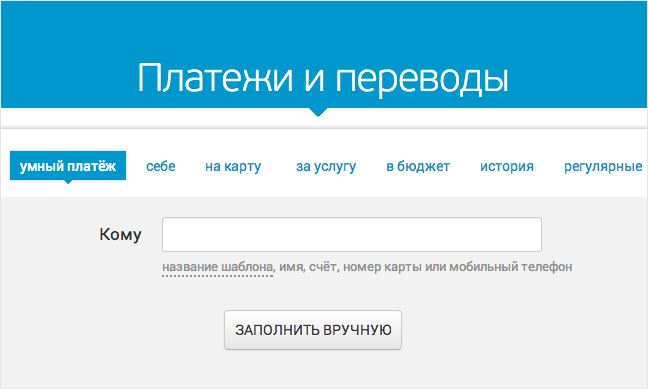
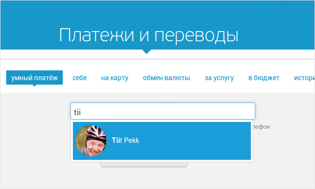
We wanted to help customers easily navigate between several different types of payments and transfers (utility payments, intra-bank transfers, transfers to another bank, tax payments etc). A customer may not have a clue, which one to use. Therefore we start with just one field - to whom, as this is the information everyone knows. Customer can start type in an account, card or phone number or even name and we can suggest other details based on previous payments or send customer to right form to fill. As simple as google search.
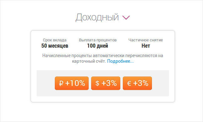
We made quite some effort making choosing a deposit easy and understandable. Fortunately the bank had quite straightforward product selection here (which is not always the case when it comes to deposits). Simple products, interest rates for different currencies seen at a glance and voila! contract is signed. Quite a difference from what was available in previous version.
A picture says thousand words, right? Following that principle we show social network (Facebook, VKontakte) avatars of people who have linked their accounts in payment history. No need to dig down to names or account numbers, a photo will identify payment to a friend. Likewise an utility payment - we show company logo in payment history.
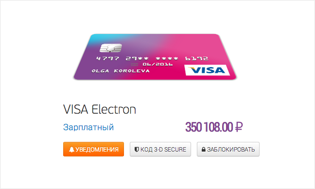
What is a CVV? Do you have VISA or Mastercard? What is the expiration date of your card? In what format should I enter all this data? To help the customer with all those questions, we visualize bank cards as they are in the real world. Easy to understand, what number to enter and where. Plus some interactivity always brings some life into dry financial world :)
Too sexy?
During internal testing phase, a bank employee sent the working group a panicking email - the site was blocked by Kaspersky anti-virus as containing adult content! The bank followed up with the antivirus software provider, but they were not able to explain it. As the project lead in the Bank stated, maybe we were too sexy for Kaspersky …
Our recent stories
The story of Mihkel and Misha creating the Fussball app
We now have our own internal app called Fussball. We talked to its creators, Misha and Mihkel, about what it does and what motivated them to spend their free time building it.
The Codeborne Christmas beer brewing diaries
It was a sunny day in September. Quite warm for that time of year. We were sitting with my colleague Tiit on the roof terrace in the Codeborne office as we do every now and then. I ask him for advice on occasion - after all, what are the more experienced colleagues good for otherwise?
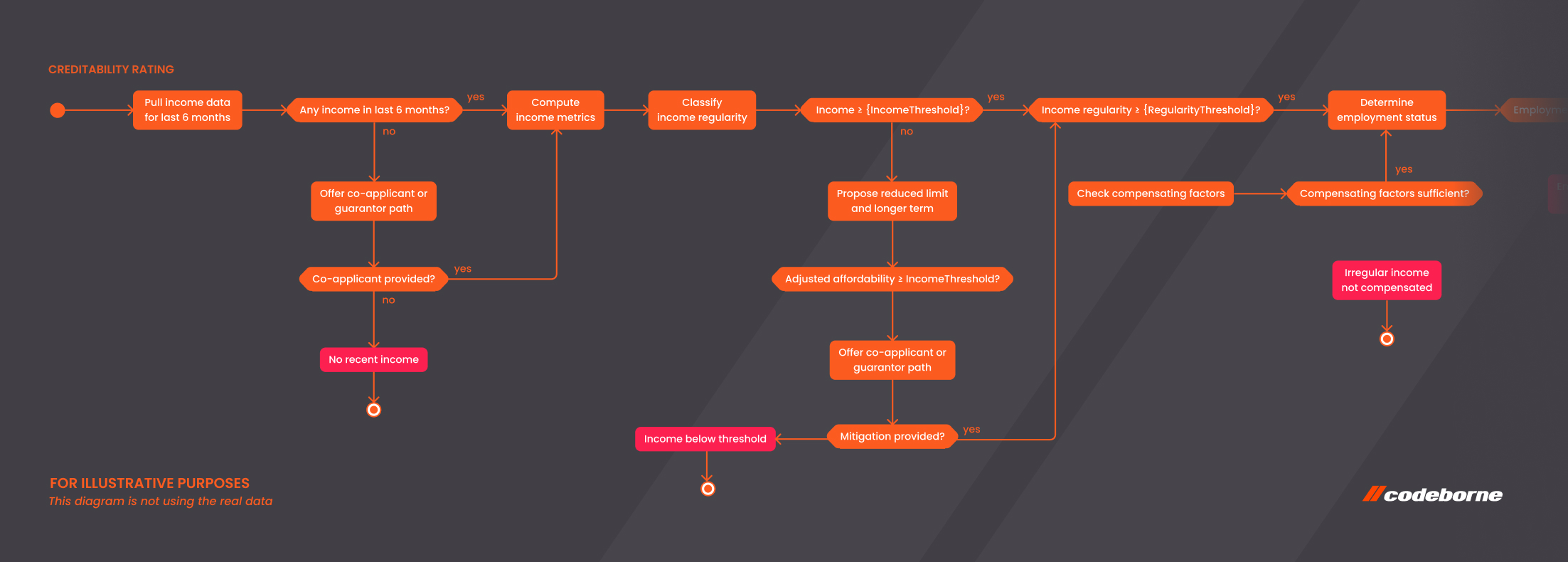
“Backing up” a good product owner
One of the key players in most successful agile projects is a product owner, at least in Codeborne’s practice. Our practice stretches for more than 15 years, during which we have successfully delivered over 100 projects.
